What a 100 year logo design really means
A 100 year logo design does not mean the logo will never change. It means the core memory structure can survive change. The mark can become flatter, cleaner, more digital, or more refined, while customers still recognize the brand quickly.
That distinction matters for founders. A young company may change its product, audience, pricing, or category language. The logo needs enough discipline to carry early traction without locking the company into a narrow visual joke.
Think of the logo as a memory asset. It helps people identify the company before they read the full name, scan the headline, or open the deck. If the logo depends on a trend to feel interesting, it usually loses value when the trend fades.
Good timeless logo design does three jobs at once: it identifies the brand, it reduces visual confusion, and it gives the wider brand identity design system a stable anchor.
Lessons from long-running logo identities
Long-running identities rarely stay frozen. They keep the part people remember and improve the parts that age. That is the useful lesson from brands such as Coca-Cola, BMW, Shell, and IBM.
Coca-Cola says Frank M. Robinson wrote the name in Spencerian script, a handwriting style that gave the mark a distinct form. The lesson is not that every founder needs a script logo. The lesson is that a distinctive gesture can build memory for more than a century.
BMW explains that its logo history starts with the circular Rapp Motorenwerke tradition and a roundel structure that has stayed familiar since 1917. The brand has updated details, but it has protected the circle, name placement, and blue-white center as recognition assets.
Shell documents the move from early shell drawings to the pecten mark. IBM highlights Paul Rand’s 8-bar logo, created in 1972, as a flexible corporate identity asset. Each case points to the same principle: lasting logos protect the core idea while improving execution.
Source links used for this section: Coca-Cola on the origin of its name and logo, BMW on the meaning and history of its logo, Shell brand history, and IBM logo history.
Use this table before approving a new identity. It separates durable logo design ideas from choices that often age quickly.
| Decision area | Timeless choice | Weak choice | Founder test |
|---|---|---|---|
| Core shape | Simple silhouette with clear negative space | Detailed illustration that fails when small | Can someone sketch the mark from memory after three seconds? |
| Typography | Custom wordmark spacing, optical balance, readable letters | Unmodified fashion font with poor kerning | Does the wordmark still feel ownable without the symbol? |
| Color | Limited palette with contrast in light and dark contexts | Trend gradient that carries the whole identity | Does it work in black, white, and one brand color? |
| System | Master logo, horizontal lockup, icon, spacing rules | One PNG used everywhere | Can a teammate use it without asking the designer every time? |
| Meaning | A clear connection to positioning, product, audience, or story | A generic symbol chosen because it looks premium | Could another company in the category use the same idea? |
A lasting logo does not need to look plain. It needs a strong base so the brand can refresh campaigns without rebuilding recognition from zero.
100 year logo design ideas founders can actually use
The best 100 year logo design ideas are not moodboard labels. They are practical identity routes that can turn into a working logo system. Start with one route, then test it across real brand touchpoints.
1. Build a custom wordmark
A custom wordmark works when the name is clear, short enough to remember, and important to the brand. The designer can adjust terminals, dots, joins, spacing, and letter width so the name no longer feels typed from a font menu.
This route suits founder-led studios, SaaS tools, consulting brands, creative companies, and premium service businesses. It also works when the name itself carries trust and the symbol would add noise.
2. Use a geometric monogram
A monogram logo works when the initials can form a compact mark. Shared strokes, consistent angles, and strong counters make the mark feel built. Random letter overlap usually feels cheap.
Test the monogram without the full name. If the symbol has no memorable shape, simplify it before adding style.
3. Create a contained emblem
An emblem works for brands that need craft, place, heritage, certification, or membership cues. Badges, shields, and seals can feel permanent when the line work stays simple.
Avoid stuffing the emblem with dates, taglines, tiny icons, and decorative ornaments. The more the logo explains, the less it identifies.
4. Design a responsive logo family
A responsive logo family gives the brand a full lockup, compact lockup, symbol, favicon, social avatar, and one-color version. This is usually more useful than one perfect master logo.
A responsive family protects recognition across pitch decks, product UI, invoices, packaging, signage, and mobile navigation.
5. Anchor the symbol in one metaphor
Choose one idea and commit. Do not combine a rocket, graph, globe, leaf, spark, and initials into the same mark. A single metaphor gives the viewer something to remember.
For a startup, the metaphor should come from the customer problem, product behavior, founder story, or category tension. It should not come from a random icon search.
Different companies need different kinds of logo systems. Use this table to choose a route before visual exploration starts.
| Business type | Best logo direction | Why it works | Watch out for |
|---|---|---|---|
| SaaS startup | Custom wordmark plus simple app icon | Keeps the name clear and supports product UI | Overly abstract symbols with no product memory |
| Premium service studio | Wordmark, monogram, or refined signature mark | Builds trust without over-explaining the offer | Luxury cliches, thin lines, and poor small-size readability |
| Hospitality or food brand | Emblem, wordmark, or symbol tied to place and ritual | Gives the brand tactile memory across packaging and interiors | Too many heritage details packed into one badge |
| Founder-led company | Name-first identity with a flexible symbol | Lets personal reputation compound into brand recognition | Initials that feel generic or hard to pronounce |
| Productized service | Clear wordmark with a modular graphic device | Works across landing pages, decks, ads, and templates | A logo that looks good alone but fails in layouts |
A founder does not need a hundred concepts. A founder needs a few strong routes tested against real use.
The pre-approval checklist for a lasting logo system
Before you approve a logo, test it like an operating asset. A logo is not done because it looks impressive on a black mockup. It is done when the team can use it without breaking it.
Memory test
Show the logo for three seconds. Ask someone to describe it without seeing it again. If they only remember the color or the category, the core shape may not be strong enough.
Scale test
Export the logo as a favicon, social avatar, slide title, invoice header, footer mark, and app icon. If detail disappears, build a smaller version instead of forcing the master logo everywhere.
One-color test
Remove every gradient, shadow, texture, and image. A durable mark should hold in black, white, and one brand color.
Spacing test
Check the space inside letters, between letters, around the symbol, and around the full lockup. Most amateur logos fail because spacing feels accidental.
Ownership test
Place the logo beside five competitors. If it can swap names with any of them, the idea is too generic.
System test
Ask for the full logo family: master, horizontal, stacked, icon, monochrome, reversed, minimum size, clear space, misuse examples, and export files. That is what makes the logo useful after launch.
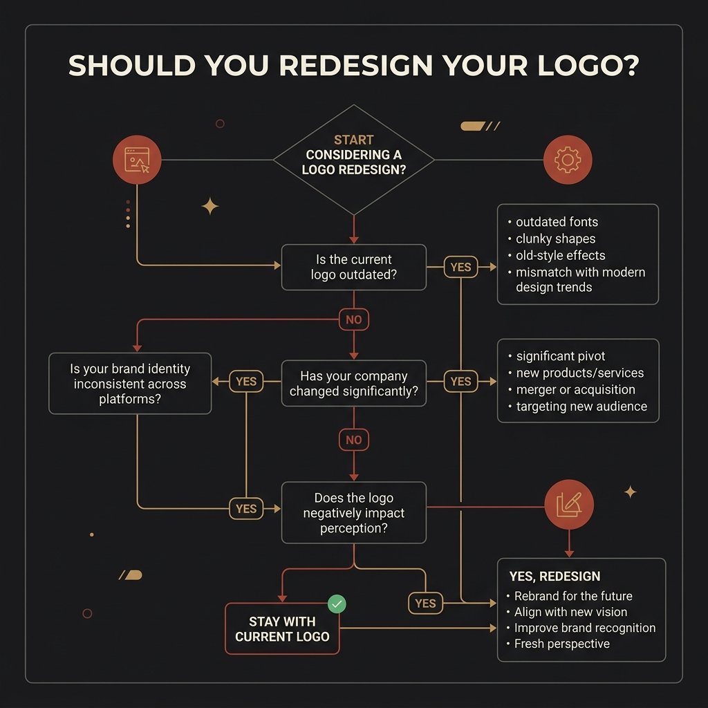
When should a founder redesign the logo?
A logo redesign makes sense when the company has outgrown the strategy behind the mark. It does not make sense just because the team feels bored.
Redesign when the logo misrepresents the offer, fails in digital formats, creates confusion with competitors, blocks new product lines, or looks too amateur for the company stage. Refresh when the core idea is still strong but the details feel dated.
This is where many startups waste money. They replace the whole identity when they only needed better typography, sharper spacing, a cleaner icon, or clearer rules.
If you already paid for a brand system and only use the logo, read why most founders use only 10% of their brand identity. It explains why the logo is only one part of the system.
Use this table when the team wants a new logo but the business case is unclear.
| Signal | Refresh | Redesign | Founder action |
|---|---|---|---|
| The mark is recognizable but dated | Yes | Usually no | Simplify details, update type, improve spacing |
| The business has changed category | Maybe | Often yes | Revisit positioning before touching visuals |
| The logo fails in app icons or favicons | Yes | Only if the core shape fails | Create a responsive icon version |
| The brand looks like every AI-generated competitor | Maybe | Often yes | Audit category sameness and rebuild ownable cues |
| The team is simply tired of seeing it | No | No | Change campaign design before changing identity |
A good logo redesign protects useful recognition. It removes friction without deleting memory.
How AI should support logo design without making the brand generic
AI can help with research, route exploration, naming angles, moodboards, competitor pattern checks, and early composition studies. It should not replace strategy, vector craft, trademark review, or real-world testing.
The risk is sameness. AI tools often generate polished marks that share the same curves, spark icons, gradient blobs, and startup symbols. That can make the brand look acceptable and forgettable at the same time.
Use AI to widen exploration, then use human judgment to narrow the work. A strong designer should test originality, spacing, legal risk, usage rules, and whether the logo can survive outside the prompt.
For a deeper audit, read AI Slop in Branding. It shows how generic AI visuals make startups blend in and how to catch the problem before launch.
How to make the logo useful after launch
The launch is where many logo projects fail. The mark looks strong in a presentation, then falls apart in the website header, pitch deck, social posts, proposal PDFs, and product UI.
Build the identity around real assets from day one. A founder needs a logo system, not a logo shrine.
Connect the logo to brand identity design
The logo should inherit from positioning, audience, tone, and visual strategy. If you need the whole system, start with Brand Identity Design.
Connect the identity to marketing assets
A durable logo needs layouts around it: pitch decks, social templates, brochures, ads, and launch graphics. That is where Graphic Design Services protect consistency after the identity ships.
Connect the mark to product experience
If the company sells software, the logo must work in navigation, onboarding, dashboard states, app icons, and product emails. Pair the identity with UI/UX Design Services so the craft survives inside the product.
Use real case-study thinking
The Homer & Greek brand identity case study shows how logo direction, color, typography, and collateral need to work as one connected system.
100 year logo design FAQs
What is a 100 year logo design?
A 100 year logo design is a logo system built for long-term recognition. It uses a clear visual idea, restrained detail, flexible versions, and strong usage rules so the brand can evolve without losing memory.
Can a startup really design a logo for the next 100 years?
A startup cannot predict the next 100 years. It can design a logo that avoids disposable trends, works across current channels, and leaves room for product, audience, and category change.
What makes a logo look dated?
Weak spacing, trend effects, generic symbols, excessive detail, unreadable typography, and poor small-size performance make logos date quickly. A logo also dates when it only works in one mockup style.
Should I choose a wordmark, monogram, or symbol?
Choose based on the name, audience, category, and usage needs. A wordmark helps when name recognition matters. A monogram helps when initials form a strong compact shape. A symbol helps when the brand has one memorable metaphor.
Does Rank Math read ACF blog content?
Rank Math reads native editor content most reliably. This theme mirrors structured blog sections into the editor body for SEO analysis while the frontend still renders the polished ACF layout.
Can AI create a timeless logo?
AI can help with exploration and research, but a durable logo still needs human strategy, vector craft, originality checks, usage rules, and practical testing across touchpoints.
Final takeaway
A 100 year logo design starts with restraint. Make the mark simple enough to remember, specific enough to own, and flexible enough to use across every customer touchpoint.
Study long-running identities for their discipline, not their decoration. Then build a system your team can actually use. That is what gives a logo the chance to compound recognition instead of restarting every two years.