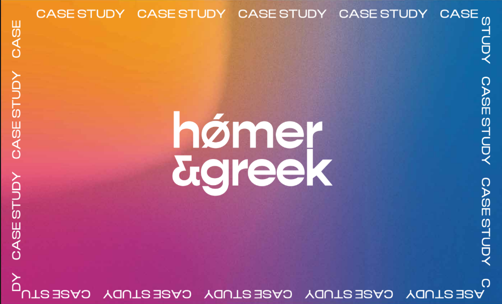
Homer & Greek Built for the modern era.
A complete brand identity for a B2B tech agency that needed to feel ancient and modern at once — rooted in Greek philosophy, built for a digital-first world.
01The Brief
Homer and Greek Agency came with a clear creative challenge - build a brand identity that feels rooted in ancient Greek philosophy, yet speaks fluently to modern tech audiences. The name set the stage: mythology, wisdom, power, and the timeless.This brand identity design project required balancing ancient Greek aesthetics with modern tech positioning.
02The Challenge
The brief sat at a difficult intersection. Greek mythology evokes warriors, gods, and stone sculptures. But the audience was modern B2B tech buyers who needed to feel trust, intelligence and speed. Every early direction leaned too far one way - too ancient, too warrior-like, or too disconnected from technology. The challenge was finding a visual language that held both worlds without compromise.
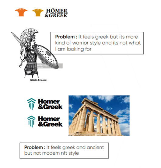
The Ancient Wordmark
The first direction explored classical Greek letterforms serif type with an ancient, philosophical feel. The problem was immediate: it read as history and warriors rather than modern tech. Not the direction Homer and Greek needed.
Greek Gods as Icons
Next came iconography – Poseidon’s trident as a symbol of power and mastery. It felt authentically Greek but the trident is tied to water and mythology in a way that distanced it completely from technology. Discarded.
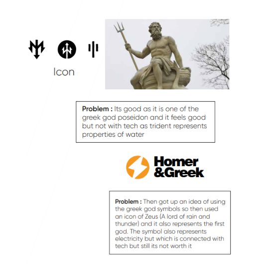
Zeus - God of Thunder
Zeus’s lightning bolt was the natural next step – electricity, power, the first of the gods. It carried a tech connotation that felt closer to the brief. But the icon alone still wasn’t hitting the right balance of sophistication. The mark needed something more intrinsic.
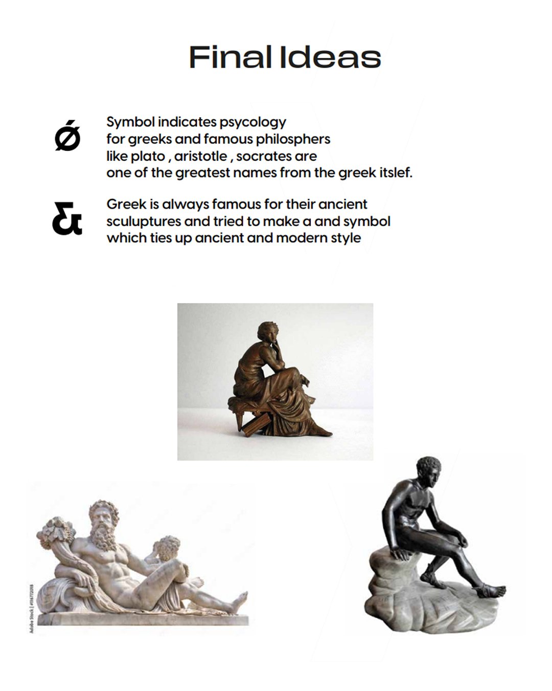
The Final - Brand Logo Design
Research into Greek philosophy led to the Ø symbol – associated with the great Greek thinkers: Plato, Aristotle, Socrates. Replacing the ‘o’ in Homer with Ø embedded intellectual heritage directly into the wordmark. Paired with a custom ‘&’ referencing ancient Greek sculptural forms, the mark suddenly held both worlds in perfect balance.
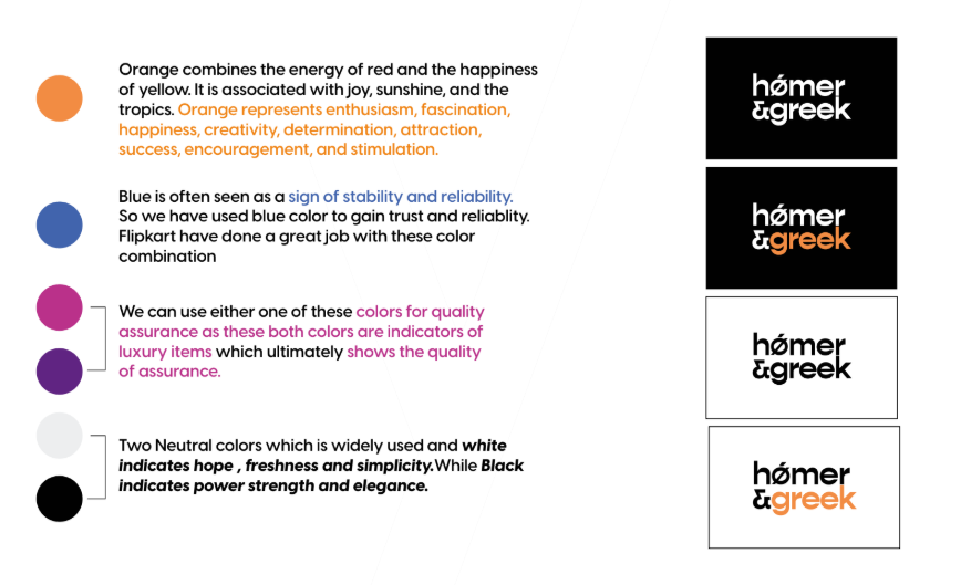
04The Colour System
Four colour directions were developed, each expressing a different facet of the brand personality.
- Orange + Blue Primary palette - energy, enthusiasm and trust. Inspired by high-performing tech brands.
- Purple + Gold Luxury tier - quality assurance and premium positioning.
- Black + White Neutral system - power, elegance, simplicity. Works across all collateral at any scale.
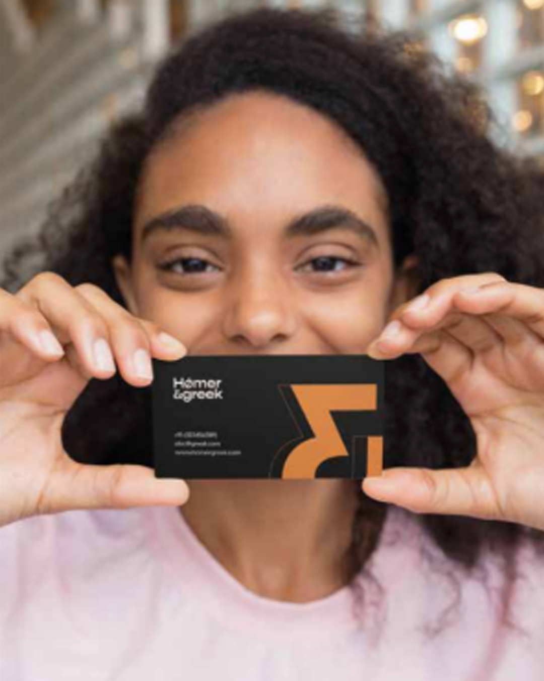
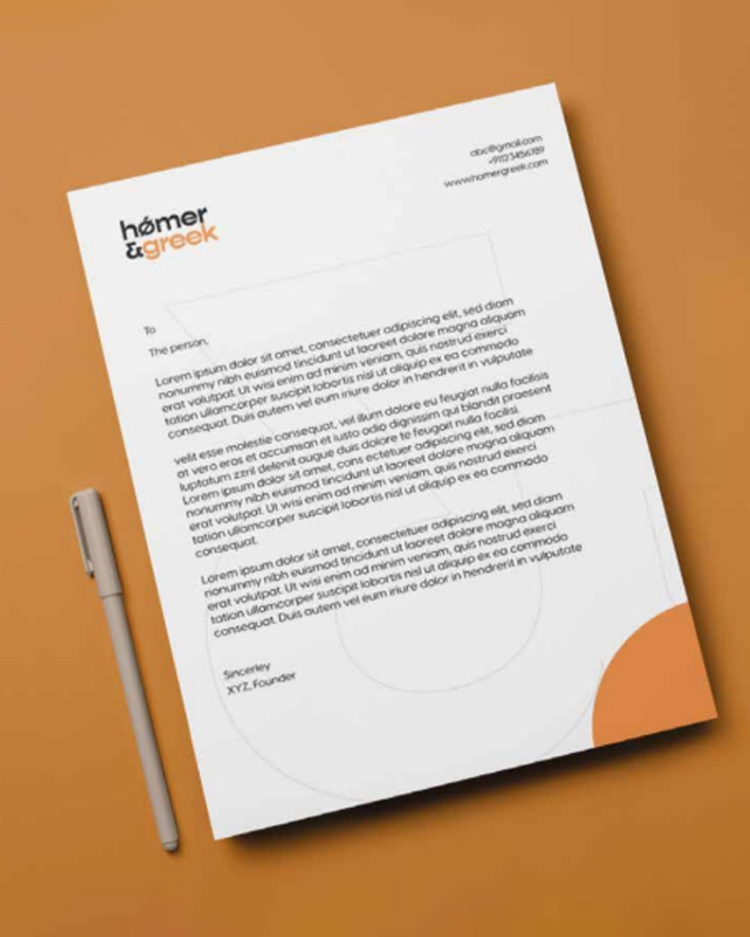
05Collateral & Application
The identity was extended across a full set of brand collateral business cards, letterheads, and a brand magazine to demonstrate how the mark and colour system perform across real touchpoints. Each piece was designed to feel cohesive, premium, and ready to represent the agency in front of its B2B and tech audience.