The logo is not your brand
The client gets the delivery email. They download the logo, upload it to the website, update the Instagram profile picture, and close the folder. Done.
Six months later, the pitch deck is in a different font. The email signature still has the old logo. The LinkedIn banner is a random Canva color their designer never approved.
Nobody made a conscious choice to let this happen. The brand identity design process was done right. The studio delivered everything correctly. The problem is the client treated the logo as the final product instead of the first piece of a larger system.
This is the 10% problem. You paid for a complete brand system and you are using the most visible slice of it. The other 90% is sitting in a Google Drive folder with a name like “Brand Stuff Final.”
This post is about what is in that folder and why it matters more than you think.
What the brand identity design process actually delivers
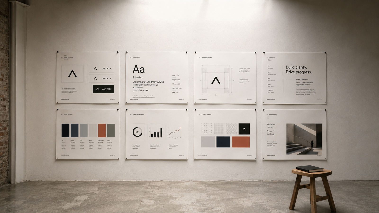
A professional brand identity design process does not just make a logo. It builds a visual and communication system that covers every situation your business shows up in.
That system typically includes all of these.
A primary logo and its approved variations. A horizontal version, a stacked version, and an icon-only mark. Each exists for a specific use case. The icon is for profile pictures. The horizontal is for document headers. Using the wrong version in the wrong place is a small mistake that quietly compounds.
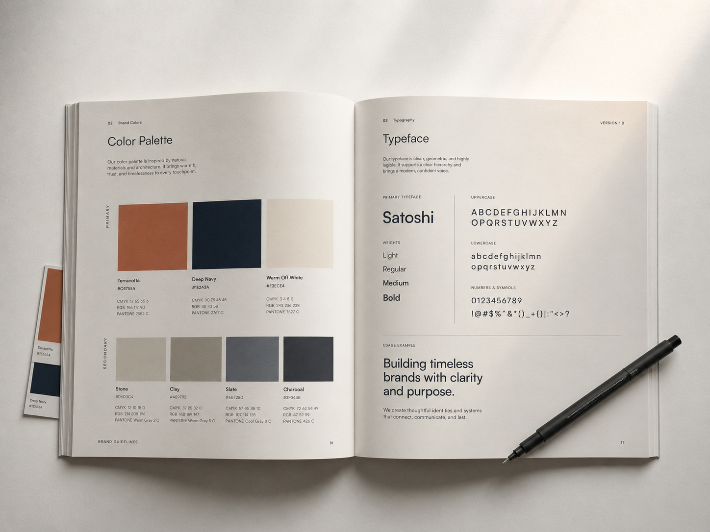
A full color palette with exact codes. Not just hex values for screens. CMYK codes for print. Pantone references for physical materials. Usage rules that explain which color is primary, which is secondary, and which almost never gets used.
Typography with a clear hierarchy. A heading font, a body font, sometimes an accent. Rules for size relationships, line spacing, and when bold is appropriate versus regular.
A brand voice document. This tells you how your brand sounds when it writes. Formal or casual. Direct or warm. What language to avoid. What your brand would never say.
We need things like patterns and icon sets to make our stuff look nice. We also need textures and illustration styles that make everything feel like it is part of the thing.
We should have a document that has all of these things in one place, like a brand guidelines document that ties all of the above together. This brand guidelines document is really important because it keeps everything easy to find.
Startup founders read the delivery email. They save the logo file.. They never open the guidelines PDF. Everything else, in that folder usually gets ignored.
If you went through a full brand identity design process and you are only using the logo, you left most of your investment on the table.
Mistake 1: You treated the logo as the finish line
The logo is the entry point into your visual identity. It is not the conclusion of it.
When a studio runs you through the brand identity design process, the logo reveal is a milestone. The deliverable is the entire system. The logo is just the most recognizable output of that system.
Here is how this mistake plays out in practice. The client approves the final logo design and feels a sense of completion. The project is done. The investment is made. The logo is live on the website.
What is there to think about?
The brand guidelines and the color system and the typography rules and the voice documentation are all in the same folder where we got everything else.
These things do not feel as exciting, as seeing the logo for the time.
So people just file the brand guidelines and the color system and the typography rules and the voice documentation away. Then they forget about them.
The result is a business that looks sharp in one place and disorganized everywhere else. The website header is clean and professional. The proposal is in Arial on a plain white Google Doc. The pitch deck is a modified PowerPoint template from 2019. The Instagram feed has no visual connection to any of it.
Your logo can only carry so much of the brand on its own. The rest of the system is what makes the brand actually work across every surface it touches.
Mistake 2: Your brand guidelines are sitting in a folder
The brand guidelines document is the most operational output from any brand identity project. It is also the least used piece of what you paid for. Most clients receive the PDF, scroll through it once to see how it looks, and then store it somewhere they cannot find again. A year later they cannot remember the exact primary color and just eyeball something close. Their team makes design decisions by guessing. New hires have no reference for how the brand looks or sounds. This is not a design problem. It is a systems problem. Everything delivered from the brand identity design process was built to be used daily, not filed away. The guidelines are not a portfolio piece or a ceremonial deliverable. They are a reference tool for every single person who touches your brand. Your social media manager, your developer, your copywriter, your VA, the freelancer you hired for a one-off project. All of them need access to the same document. When those people do not have guidelines, they make their own decisions. Those decisions will be slightly different from each other. Over time, small differences turn into a brand that feels inconsistent and unreliable. Here is the fix. Find your brand guidelines right now. If you cannot locate them in under 60 seconds, that is already a problem worth solving today. Once you find them, put the document somewhere your team can access in under 30 seconds. Link to it in your team Notion or Slack. Add it to your onboarding process. Then actually read it. You might be surprised by how much useful guidance is already in there. For teams that need ongoing design support to keep every new asset on-brand, our graphic design services are built to apply your brand system consistently across every touchpoint.
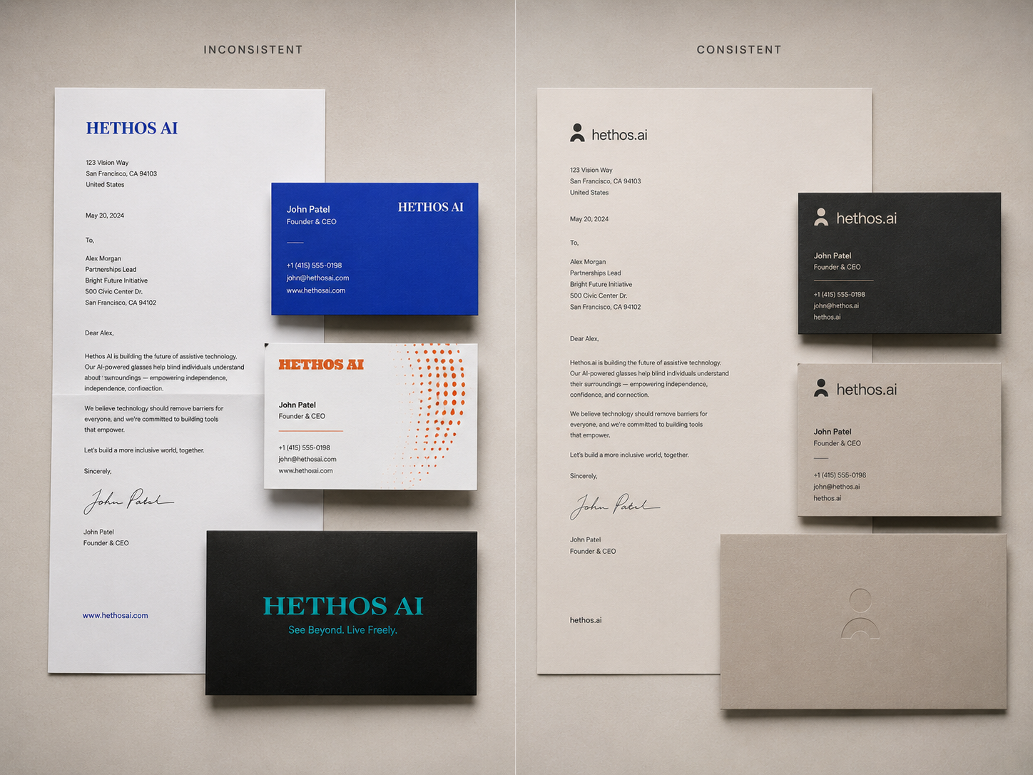
Mistake 3: Every touchpoint looks like a different company
Here is a simple thing you can do. Go to five places where your brand’s right now: your website, your Instagram, your pitch deck, your email signature and the proposal you sent to your last client.
Put all these things next to each other. Then ask yourself: do these things really look like they are from the company?
For a lot of people who start businesses the answer is no. Your website might look really good. Your pitch deck might be something you made from a template on Canva. Your proposal might just be a document from Word. Your Instagram might have three fonts in your last ten posts.. Your email signature might not match anything else.
This is exactly what happens when you complete the brand identity design process but do not apply it consistently after delivery.
People start to recognize your brand when they see the things over and over. When someone sees the colors and fonts every time they see your brand they start to remember you. They start to trust you before they even read what you have to say.. That trust makes it a lot easier to sell things hire people and get recommendations.
When your touchpoints do not look the same it breaks the people trust. Every time you make something that does not look like your brand it is, like starting over.
So pick one touchpoint this week. Make it look like your brand. Then pick another one week. You do not have to fix everything now. You just need to stop making things that do not look like your brand.
Mistake 4: You think branding is something you did, not something you do
This is the biggest mindset gap I see with founders who underuse their brand investment.
People think that branding is something that has a beginning and an end. They hire a studio the studio does the brand identity design they get the files and that is it.
The thing, about branding is that it is not something you do and then forget about. Branding is something that you have to keep working on like the Coca Cola brand, the Nike brand and the Apple brand these brands are always doing something with their branding.
The brand identity design process is like a starting point. It gives you a base to work with something that is made just for your business and the people who are interested in it. What you do with the brand identity design process after that, like what you add to it over the year and the years that follow that is what really makes the brand identity design process valuable. The brand identity design process is what you build on. It is what makes your business stand out.
When you put up a post on social media you are making a decision about your brand. This is true for everything you do. Every proposal you send to someone every email you write and every presentation you give to people is a moment when they interact with your brand.
You are either making your brand stronger or weaker with each of these things that you do. There is no in between every single thing you do has an effect, on your brand.
The founders who get the most from their brand investment treat the guidelines as a daily operational tool. They check them before building a new template. They share them with every new team member. They revisit them when something starts to feel off. A brand that shows up consistently for two years looks completely different from one that shows up randomly. The consistent brand feels established and trustworthy. The inconsistent one looks like it is still figuring itself out. You are not done with your brand just because the project invoice was paid.
Nielsen Norman Group's research on visual design shows that users judge the credibility of a business based on its visual coherence before they read a single word. The brand identity design process is built specifically to create that coherence. When you do not use the system it delivered, you lose the credibility it was designed to build.
The real cost of using 10% of your brand
There is a practical cost to using only 10% of your brand system. It is not just aesthetic.
The brand identity design process is one of the highest-leverage investments a growing business can make. But that leverage only works when you use the system it produced. When you use 10%, you get 10% of the return.
When your brand looks inconsistent, prospects lose confidence. They may not be able to put it into words. But when your website is polished and your proposal looks like an afterthought, something does not add up. The subconscious read is: this person does not pay attention to detail.
When you cannot refer new team members or freelancers to brand guidelines, every person who creates something for your business has to guess. Those guesses take time. They often need revisions. That is real time and real money going toward decisions your guidelines document would have settled in under a minute.
When your brand is not visually recognizable, you work harder for every single impression. The person who saw your Instagram post last month will not connect it to your pitch deck this month. You are not building a brand in their memory. You are starting from zero every time you show up somewhere new.
A studio invests weeks into the brand identity design process specifically to prevent these compounding problems. When you only use the logo, you undo most of that work without realising it.
If your brand is live but not working, the problem is almost never the design. The problem is usually that nobody is using the system.
How to get the most from your brand identity design process
You do not need to overhaul your entire business in a week. Here is a straightforward process that actually works. If you want to understand how a full project is structured from the start, you can see how we approach a brand identity project at VedaCreatives. Your brand identity design process does not end at delivery Most founders treat the file handoff as the finish line. But the brand identity design process is designed to continue in your hands. Every template you build, every post you publish, and every proposal you send is an extension of it. The guidelines document is your instruction manual for that continuation. Step one: Find your deliverables. Track down the brand guidelines PDF, the full logo file package, the color codes, and the typography information. If you cannot find them, email your designer today. A studio that ran you through a proper brand identity design process should have all of this ready to resend. Step two: Set up one shared folder. Put every brand asset in a single location your whole team can reach. Name it something obvious. Brand Assets is fine. Add the guidelines document, the logo files in every format, and any branded templates you received. Make this the first thing you share with any new team member, VA, or freelancer. Step three: Run a quick brand audit. Look at your five most important touchpoints. Your website, social media, pitch deck, proposals, and email signature. Write down where you are off-brand. You do not need to fix everything today. You need a clear picture of where the gaps actually are. Step four: Fix one touchpoint per week. Start with the most visible or most frequently used one. Apply the guidelines fully. Then move to the next one the following week. Step five: Add the brand guidelines to your onboarding process. Every person who ever creates anything for your business should receive the brand guidelines document in their first 24 hours. This is not complicated work. Most of it is organisational. But it is the exact difference between a brand that builds recognition over time and a brand that just exists without doing anything useful. Every step of the brand identity design process was designed to make your business easier to run. Let it do that job.

What consistent branding actually does for your business
When a business applies its brand consistently across every touchpoint over a sustained period, the results are very specific. This is not theory. You can see it happen.
The business looks bigger than it is. A solo consultant with a consistent, well-applied brand feels more established than a team of ten running a disorganized one. That is not about pretending to be something you are not. It is about showing that you take the work seriously. Clients read that signal immediately.
Proposals get accepted at a higher rate. Not because the design changed the actual content of the proposal. Because consistent professionalism built trust before the client read the first paragraph. First impressions operate at the system level, not just at the logo level.
Referrals become easier. When your brand is visually recognizable, people can describe you without effort. “The brand studio with the clean minimal aesthetic” is something a happy client can say to a colleague in 10 seconds. Referrals need a hook. A consistent brand gives people one.
Content takes less time to produce. Once your templates actually match your guidelines, every post, every graphic, every document takes less thinking. The design decisions are already made. You just execute and move forward.
The brand identity design process sets all of this up for you. Most founders just never use the system it delivered. The gap is not in the design. The gap is in the application.
Questions about brand identity
What is the brand identity design process?
The brand identity design process is how a studio builds a complete visual and communication system for your business. It starts with research and strategy, moves through logo design, color selection, typography, and brand voice development, and ends with a guidelines document that explains how everything works together. A proper process gives you a full system, not just a logo file.
How long does a brand identity project take?
Most brand identity projects take 4 to 8 weeks. The timeline depends on the scope of work, how many rounds of feedback happen, and how quickly the client is able to give input and approvals. Larger businesses with multiple product lines or international markets may need more time.
What should I actually do with my brand guidelines document?
Use it every time you or anyone on your team creates something for your business. The brand identity design process does not end when you receive the files. It continues every time you apply what was built. Share the document with your designer, developer, copywriter, and any freelancer you hire. Put it somewhere your team can find in under 30 seconds. It is not an archive document. It is an operational reference tool that should be in active use.
Can I update my brand identity after launch?
Yes. Most strong brands evolve over time. Small updates like refining a secondary color or adjusting the typography scale are normal. Full rebrands usually happen every 5 to 10 years, when a business has meaningfully shifted its direction, audience, or market position.
Why does brand consistency matter specifically for small businesses?
Brand consistency makes small businesses look more established than their size suggests. When every touchpoint matches, it signals that you pay attention to detail. The brand identity design process is designed with this compounding effect in mind. Over time, consistency builds recognition. Recognition builds trust. Trust drives referrals and repeat business, which is how small brands grow without spending heavily on advertising.